In the world of graphic design, shape stands as a pivotal element of design. It’s the visual aspect that gives an identity to ideas and concepts. When we discuss shape graphic design, we’re delving into how these forms influence our perception and understanding of a design. A shape element of design is not just a geometric outline; it’s a container of meaning and message.
Understanding Shape as an Element of Design
Shape in graphic design is often the first thing that catches the viewer’s eye. It can be used to:
- Directing Attention: Shapes can be strategically employed to guide the viewer’s gaze. Designers use shapes to create focal points, leading the eye to specific elements within the composition. For instance, a bold, contrasting geometric shape can draw attention to a particular message or image;
- Organizing Information: Shapes help in structuring and compartmentalizing information. They act as visual containers, delineating different sections of a design. A rectangular shape, for example, can frame a text block, making it distinct from the surrounding content;
- Conveying Mood or Feeling: Shapes possess inherent emotional qualities. Geometric shapes often convey a sense of stability, order, and formality, while organic shapes evoke feelings of naturalness, spontaneity, and fluidity. The choice of shapes can profoundly influence the emotional impact of a design;
- Representing Ideas Symbolically: Shapes can be used symbolically to represent abstract concepts, ideas, or themes. For instance, a heart shape commonly symbolizes love and affection, while a star shape can signify excellence or achievement.
Categorizing Shapes: Geometric vs. Organic
Shapes can be categorized into two primary types: geometric and organic. Each type has distinct characteristics and applications:
Geometric Shapes
Geometric shapes are precise, regular, and symmetrical. They are often associated with order and stability. Here are some common geometric shapes:
| Shape | Characteristics | Symbolism/Usage |
| Square | Four equal sides, right angles | Balance, stability, reliability |
| Circle | Perfectly round, no corners | Unity, eternity, wholeness |
| Triangle | Three sides, typically sharp angles | Energy, dynamism, change |
| Rectangle | Four sides, right angles | Formality, structure, organization |
| Hexagon | Six sides, equal angles | Harmony, balance, efficiency |
Organic Shapes
Organic shapes are irregular, free-form, and often asymmetrical. They are associated with natural forms and fluidity. Here are some examples of organic shapes:
| Shape | Characteristics | Symbolism/Usage |
| Cloud | Soft, irregular, and flowing | Dreaminess, imagination, ambiguity |
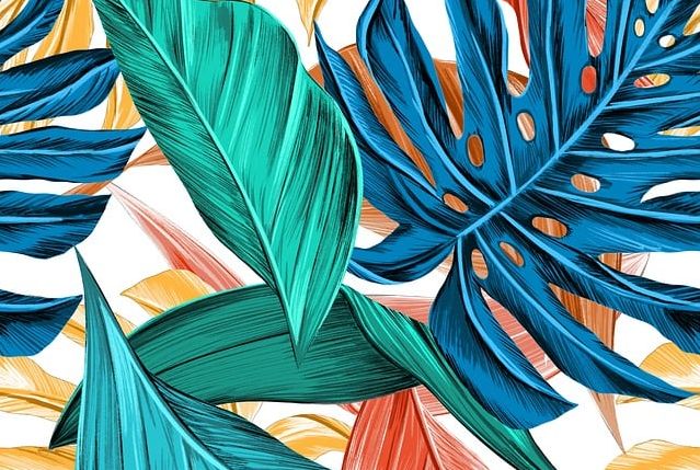
| Leaf | Natural, asymmetrical, veined | Growth, vitality, environmental themes |
| Water Splash | Fluid, dynamic, unpredictable | Motion, change, life’s unpredictability |
| Pebble | Smooth, rounded, organic | Tranquility, simplicity, nature-inspired |
| Flame | Flickering, curvilinear, fiery | Passion, transformation, energy |
Combining Shapes for Design Impact
Graphic designers often blend geometric and organic shapes to create visually engaging compositions. The juxtaposition of these contrasting shapes can convey complex messages and emotions. For instance, a poster design for an environmental campaign might use a combination of organic leaf shapes and geometric rectangles to symbolize the harmony between nature and human organization.
How Shapes Communicate in Design
Shapes in graphic design communicate through:
Association
Shapes often communicate through the associations they trigger in our minds. This concept is deeply rooted in visual semiotics, where certain shapes are culturally and universally linked to specific meanings. Here are some common associations:
| Shape | Association | Example |
| Circle | Unity, Eternity | The Olympic rings symbolize unity and the eternal nature of the games. |
| Triangle | Balance, Stability | The use of triangles in architectural design often conveys a sense of stability and balance. |
| Heart | Love, Affection | The heart shape is universally recognized as a symbol of love and affection. |
| Lightning Bolt | Energy, Power | Lightning bolt shapes are often used to signify energy and power, as seen in superhero logos. |
By leveraging these associations, designers can add layers of meaning to their work. For instance, using circles in a logo design for a global organization can emphasize the idea of worldwide unity.
Emotion
Shapes have the ability to evoke emotions in viewers. Different shapes elicit distinct emotional responses, and designers can harness this power to effectively convey a message. Here are some common emotional associations with shapes:
- Sharp, Angular Shapes: These shapes, such as triangles or jagged lines, often convey a sense of dynamism, energy, or even aggression. They can be used in designs for sports brands or action-packed events to evoke excitement;
- Soft, Curved Shapes: In contrast, soft and curved shapes like circles or ellipses tend to evoke calmness, comfort, and approachability. They are commonly used in designs for wellness centers or children’s products;
- Geometric Shapes: Clean and balanced geometric shapes, like squares and rectangles, often convey a sense of stability and reliability. They are frequently used in corporate logos and branding to instill trust.
Hierarchy and Focus
Shapes also contribute to creating a visual hierarchy in a design, which guides the viewer’s eye and emphasizes specific elements. Larger, more prominent shapes naturally draw more attention and become focal points within the composition. This principle is essential for effective information communication.
Consider the following example:
- Title Box: In a magazine layout, a large rectangular title box at the top of the page with bold typography not only communicates the title but also sets the overall tone of the content;
- Call to Action Button: In a web design, a rounded button with contrasting colors stands out and attracts users’ attention, guiding them to take the desired action;
- Infographic: Shapes in infographics help organize information hierarchically, with larger shapes representing primary categories and smaller shapes indicating subcategories.
Practical Applications of Shape in Graphic Design
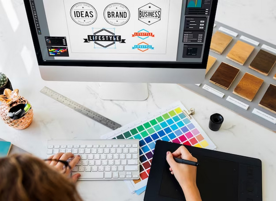
Logo Design
Logo design is perhaps one of the most prominent areas where the use of shapes is critical. Shapes can significantly influence a logo’s memorability and impact. Let’s delve into some practical applications:
- Memorability: A distinctive shape in a logo can make it instantly memorable. For instance, the circular shape of the Starbucks logo or the rectangular shape of the National Geographic logo is iconic and recognizable worldwide;
- Meaningful Representation: Shapes can be used to symbolize core values or concepts. For example, the Nike swoosh represents motion and speed, while the Apple logo’s clean, minimalist shape aligns with the brand’s design philosophy;
- Versatility: Shapes can be adapted to different media and sizes without losing their essence. This adaptability is crucial for maintaining consistency across various branding materials.
Web and App Design
Shapes play a vital role in web and app design by guiding the user’s eye, organizing content, and enhancing user experience. Here are practical applications in this context:
- Navigation: Shapes can be used as buttons or icons to guide users to essential functions. For instance, a circular button for the home page and a square button for settings provide visual cues for users;
- Hierarchy: Different shapes can be employed to establish a visual hierarchy. Larger, more prominent shapes may indicate primary actions, while smaller shapes represent secondary functions;
- Consistency: Consistent use of shapes throughout a website or app creates a cohesive and user-friendly interface. Repeated shapes for similar functions enhance navigation and comprehension.
Advertising
In advertising, shapes are potent tools for creating specific moods or feelings, aligning with the campaign’s objectives. Here are practical applications:
- Emotional Appeal: Shapes can evoke emotions in viewers. A car advertisement may use sleek, aerodynamic shapes to convey speed and excitement, while a relaxation app may feature soft, calming shapes to promote tranquility;
- Urgency and Action: Shapes can be used strategically to encourage action. Urgent promotions may utilize bold and sharp shapes to prompt a sense of immediacy, driving consumers to make a purchase or take a specific action;
- Branding and Recognition: Consistent use of shapes in advertising campaigns strengthens brand recognition. Over time, customers associate specific shapes with a brand’s identity and values.
The Interaction of Shape with Other Design Elements
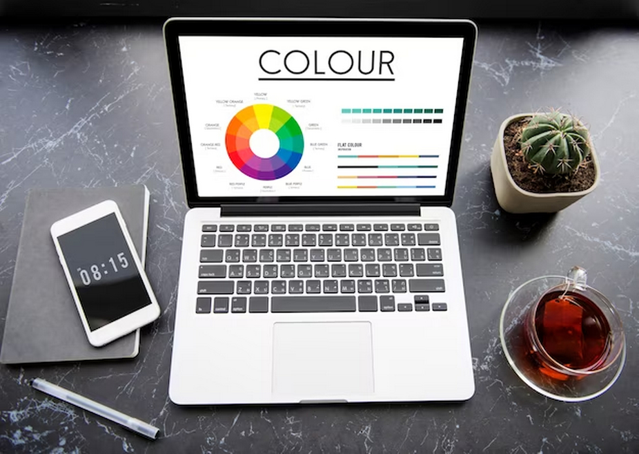
Shapes interact harmoniously with other design elements such as color, line, and texture to create a unified and visually compelling composition. Let’s explore how shapes interact with these elements, emphasizing the significance of these interactions in design.
Interaction with Color
Shapes and color are closely intertwined in design, with each influencing the other. The color of a shape can significantly impact its overall message and perception. Here’s how shape interacts with color:
- Color Symbolism: Different colors evoke distinct emotions and convey specific messages. When combined with shape, these associations can be intensified. For instance, a red circle may symbolize both unity (circle) and urgency (red);
- Contrast and Emphasis: The contrast between the color of a shape and its background can draw attention. A brightly colored shape on a neutral background creates a focal point, guiding the viewer’s eye;
- Color Harmonies: Shapes can be used in conjunction with color harmonies (e.g., complementary or analogous colors) to create visually pleasing and balanced compositions. The interaction of shape with color harmonies affects the overall aesthetic appeal of a design.
Interaction with Line
Lines and shapes are fundamental components of graphic design, and their interaction is pivotal for composition. Here’s how shape and line interact:
- Defining Form: Lines can be used to outline and define shapes, providing structure and clarity to the design. For instance, a thin, curved line can delineate the silhouette of an object or character within a shape;
- Movement and Direction: Lines can guide the viewer’s eye within a composition, leading them from one shape to another or emphasizing a particular area of interest. Shapes work in tandem with lines to establish visual flow;
- Hierarchy and Structure: The combination of shapes and lines can create hierarchy and structure in a design. Larger shapes with bold lines may serve as headers or separators, organizing content effectively.
Interaction with Texture
Texture adds depth and dimension to a design, and its interplay with shape can enhance visual appeal and convey tactile sensations. Here’s how shapes interact with texture:
- Depth and Realism: Texture applied to shapes can simulate real-world materials or surfaces, adding a tactile quality to the design. For example, a rough, textured shape may convey the feeling of stone or wood;
- Visual Interest: Combining textured and smooth shapes creates contrast and visual interest. This can be particularly effective in product packaging or branding to make a product stand out;
- Emotional Impact: Textured shapes can evoke emotions. A soft, velvety texture on a shape may evoke feelings of comfort, while a jagged texture can create tension or excitement.
Shape Graphic Design in Different Cultures
Graphic design is not a one-size-fits-all discipline; it varies significantly across cultures. Each culture has its unique set of symbols and meanings associated with different shapes. Understanding these cultural nuances is paramount for designers working in a global context:
- Symbolic Meanings: Shapes may hold different symbolic meanings in various cultures. For instance, the color red may symbolize luck and prosperity in Chinese culture but be associated with danger in Western cultures;
- Cultural Icons: Shapes can represent cultural icons or beliefs. For example, the lotus flower shape is highly symbolic in Asian cultures, representing purity and enlightenment;
- Aesthetics: Cultural preferences for certain shapes and design styles influence the visual aesthetics of design in a particular region. Designers must consider these preferences when creating culturally relevant content.
Conclusion
The element of design shape in graphic design is a powerful tool. It’s not just about creating visually pleasing arrangements; it’s about using shape to communicate ideas, evoke emotions, and create memorable designs. Whether in logo design, web design, or advertising, understanding and skillfully using the shape element of design is key to successful graphic design.
FAQ
Why is shape considered an essential element of design?
Shape is fundamental in graphic design because it helps to structure content, convey messages, and evoke emotions in a visual way.
Can the use of certain shapes affect the mood of a design?
Absolutely. Shapes have the power to evoke different emotions and set the mood of a design. For instance, circles are often seen as welcoming and inclusive, while squares suggest stability and balance.
How do shapes impact brand identity?
Shapes play a significant role in brand identity. They can make a brand appear more modern, traditional, playful, or serious. The right choice of shape can enhance brand recognition and perception.
What’s the difference between geometric and organic shapes in design?
Geometric shapes are regular and structured, like squares and triangles, conveying stability and order. Organic shapes are irregular and fluid, conveying naturalness and dynamism.
