One of the most important aspects of creating art is the idea of unity, which ensures that all of the pieces work together to create a unified whole. This article examines the concept of unity in art through a number of instances, spanning many genres and time periods.
What is Unity in Art?
It is essential to grasp what unity in art comprises before delving into examples. When all of the parts of an artwork mesh well with one another, we say that the piece is cohesive and well-executed. A work of art can establish unity by utilizing recurring themes, colors, shapes, or textures.
There are numerous critical functions that unity in art performs in the making and understanding of artworks:
- Creating Harmony: The foundation of creating harmony and completeness in artwork is unity. It guarantees that everything fits together harmoniously and aesthetically. Artwork that lacks cohesion risks coming across as disorganized and disconnected;
- Enhancing the Theme: One of the most effective ways to make an artwork’s topic or message stand out is to use unity. Artists can enhance the impact and resonance of their message by integrating aspects that resonate with the major topic. For art to communicate effectively, form and substance must be cohesive;
- Guiding the Viewer’s Eye: Unity acts as a visual guide, leading the observer’s eye fluidly and deliberately across the artwork. It controls how the composition unfolds, putting the audience in the shoes of the artist as they follow the story or experience the artist has envisioned.
Historical Examples of Unity in Art
By analyzing historical masterworks that exemplify this idea of unity in art, we can acquire a more profound comprehension of it:
| Artwork | Unity Aspect | Description |
| Renaissance Period: Leonardo da Vinci’s ‘The Last Supper’ | Composition | Harmony is portrayed in “The Last Supper” by Leonardo da Vinci. Da Vinci employs perspective and setting to highlight the central subject, Jesus Christ. This composition emphasizes the occasion and unifies the artwork. |
| Renaissance Period: Michelangelo’s ‘David’ | Proportions and Flow | ‘David,’ the famous sculpture by Michelangelo, shows harmony achieved by the artist’s meticulous attention to proportion and line flow. The statue’s smooth curves and balanced proportions make it an accurate depiction of the human figure. “David” has enduring beauty and resonance because of the unity in it. |
| Impressionism: Claude Monet’s ‘Water Lilies’ Series | Repetitive Shapes and Color Palette | The ‘Water Lilies’ paintings by Claude Monet are a powerful demonstration of harmony attained by use of form repetition and a uniform color scheme. As the series progresses, Monet deftly keeps a consistent visual language throughout. Viewers are able to lose themselves in the peaceful beauty of nature as a result of the consistent color selections and recurring themes of water lilies. |
Contemporary Examples of Unity in Art
Recognizing the continued use of this basic notion by artists across genres and media is the first step in exploring modern examples of unity in art. Here we take a look at two prominent examples: the abstract expressionist drip paintings of Jackson Pollock and the digital art movement’s use of unity in modern graphic design.
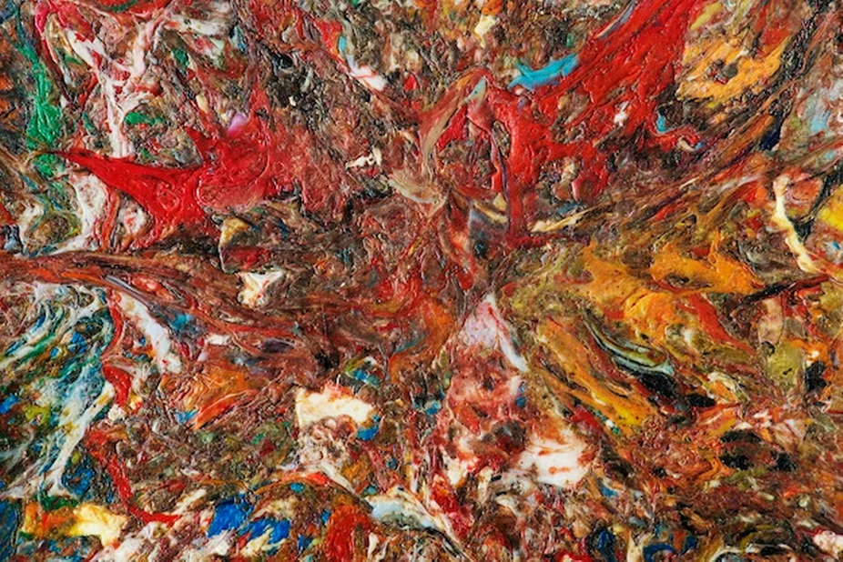
Abstract Expressionism: Jackson Pollock’s Drip Paintings
- Drip Technique for Unity: Jackson Pollock, an expressionist artist, used a unique method to make his drip paintings. His works, which at first glance look random and disorganized, are brought together by his consistent use of the drip method. You let the paint drip or run across the paper for this method to make patterns that are hard to describe. Pollock gets a great amount of unity by using this method over and over again. It’s more interesting to look at when the splashes and drips that don’t seem to go together come together to make a whole. There is a clear flow from one painting to the next in his work, showing that his artistic vision is one;
- Color Harmony: Both Pollock’s careful choice of colors and his use of the drip method help his works look like they belong together. He guides the viewer’s attention and adds depth to his abstract pieces by using a harmonious color scheme or purposely adding differences. The artwork doesn’t have any clear shapes, but the way the colors are used helps it come together.
Digital Art: Modern Graphic Design
The importance of cohesion is paramount in the field of digital art, and this is especially true in contemporary graphic design. Color palettes and geometric shapes are powerful unifying elements in many digital artworks and designs.
- Color Schemes: When creating visual content, graphic designers frequently work with a small color palette or stick to established color harmonies. The use of these colors is intentional, and it helps to unify the design visually. For example, a visually pleasing and cohesive user experience is achieved through a website’s color scheme, which uses uniform colors for buttons, text, and backgrounds;
- Geometric Shapes: Circles, squares, and triangles are some of the most common geometric shapes used to make digital graphics look cohesive. When designers repeatedly use these shapes in their work, they create harmony and order. These forms can be used as frameworks to organize content in an attractive way and direct the viewer’s gaze. For instance, in logo design, the recurrence of geometric shapes can represent dependability and steadiness, which can strengthen the brand’s message and bring the design together.
Techniques for Achieving Unity in Art
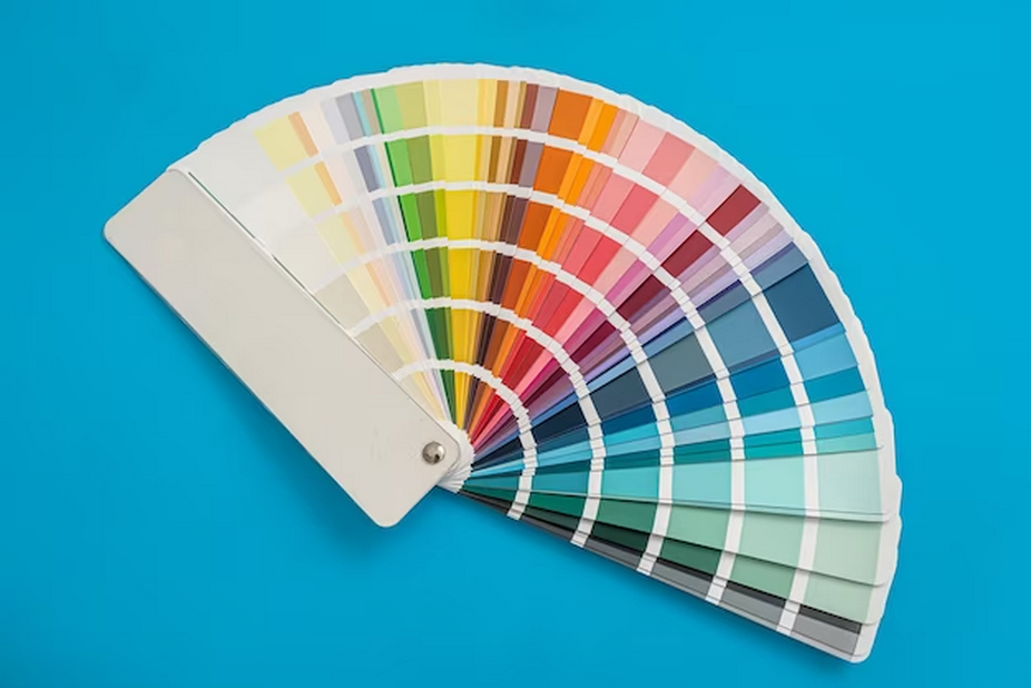
Color Harmony
A work of art’s cohesiveness can be greatly enhanced by the use of color harmony. A sense of unity is enhanced when colors harmonize with one another. Two essential methods for attaining color harmony are these:
| Color Schemes | Description | Benefits | Example |
| Monochromatic Schemes | To create a monochromatic color scheme, one hue is subtly varied via a range of tones. | Works of art with monochromatic color palettes exude a sense of calm simplicity. You can use them to make people feel relaxed or draw attention to certain parts of the scene.. | Blues of all shades, from pale sky blue to dark navy, predominate in this piece of art. |
| Analogous Colors | On the color wheel, adjacent hues are considered analogous. They complement each other well because of their shared undertones. | It is common practice to depict natural situations with analogous color schemes since they provide a visually pleasant experience. As an alternative to monochromatic designs, they allow for a wider spectrum of colors while still providing unity. | Painting with a warm and harmonious palette that includes yellow, orange, and red. |
Repetition and Pattern
Repetition and pattern are techniques that can help unify different elements within an artwork. By repeating shapes, lines, or colors, artists can guide the viewer’s eye and create a cohesive composition.
| Design Techniques | Description | Benefits | Example |
| Repeating Elements | The use of a shape, line, or color repeatedly throughout an artwork is known as an element repeat. | Visual rhythm and coherence can be achieved through repetition. It can unite seemingly unrelated parts of the composition and guide the eye through it. | The unifying effect of circular forms used repeatedly throughout an artwork. |
| Patterns | Patterns are recurring themes in art, whether they are organic patterns or geometric structures. | The use of patterns unites various parts of the composition, creating a powerful impression of cohesion. In addition to adding depth to the artwork, they can also communicate meaning. | A tiled artwork with a mosaic-style pattern that brings the design together and adds fine detail. |
Balance and Proportion
Achieving harmony in art requires attention to balance and proportion. The placement of visual components within the composition is controlled by them.
| Balance Techniques | Description | Benefits | Example |
| Symmetrical Balance | When a composition’s elements are evenly distributed on both sides, creating a mirror image of each other, we say that the composition is symmetrical. | Stability and order are evoked by symmetrical equilibrium. It gives the piece a more traditional and formal air. | A symmetrical arrangement is achieved in this portrait style by having the subject’s face reflected on both sides. |
| Asymmetrical Balance | An asymmetrical balance is one in which the visual weight, rather than the amount, of each element is prioritized. | Dynamic and aesthetically pleasing asymmetry is possible. It opens up more room for compositional freedom and originality. | Creating a sense of equilibrium in a piece of art by positioning a big, visually heavy element on one side and multiple smaller, lighter components on the other. |
Conclusion
Looking at works that demonstrate unity in art can teach us how different artists have utilized this concept to make powerful, coherent pieces. Unity is essential in all forms of artistic expression, including color, pattern, and composition. The idea of unity is a powerful tool for artists, who may take their work to the next level by incorporating it into their work.
FAQ
Is it possible for there to be no shared aspects in art for there to be unity?
Yes, harmony can also be attained by contrasting or harmonizing different parts to form a unified whole.
How significant is cohesion in artistic creation?
All parts of the artwork must function in harmony with one another to create a whole, which is why unity is so important.
In art, is it possible to have too much unity?
Yes, monotony can result from an overabundance of oneness. To maintain interest in the artwork, it is necessary to strike a balance between uniformity and diversity.
Is there a universal principle of unity in art?
All kinds of creative expression, from traditional media like painting and sculpture to more modern ones like digital art and design, adhere to the notion of oneness.